
It’s the nature of fandom. Every fan wants to hold his or her hobby close, be part of it, and contribute to it in some way. Writing, drawing, researching about action, the exotic worlds, the beautiful women and heroic men, the incredible beasts and unknown races are the life’s blood of many an Edgar Rice Burroughs fan in a world of mundane days and tedious nights.
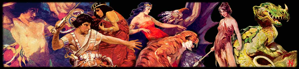
When a fan wants to take the daring step of publishing their work, they often turn to the books that first set their hearts racing, the first books they saw and took home and devoured as their own. They look at those books and want to emulate them, the stirring words, the heroic artwork, the title lettering that called them to adventure. For those who were around during the Edgar Rice Burroughs Rediscovery Boom of the 1960s, those books are the small, 40-cent paperbacks from Ace Books published from 1962 to 1964. The look of those books, with their Roy Krenkel and Frank Frazetta art, is what takes them back to the first thrill, it stamps the book as authentic in a way that other cover designs can’t. Even the title lettering plays a part. That’s when I hear the question, “What was that font that was used on the Ace ERB paperbacks?”
Believe it or not, that question turns up several times on the internet. On typography-related web sites there’re a number of attempts to find an answer and nail down the titling font and its source. One of the most common answers is to point interested people to a font named “Mephisto” available at several free font download spots. This version of the Ace titling font was built by David Nalle of The Scriptorium http://www.fontcraft.com/fontcraft/ in the mid-1990s. He says it’s been popular for fantasy and horror publications as well as heavy metal bands. (If you’re going to use it, you should buy it from him and honor the license.)

Well, this is okay as far as it goes, but there’s no mention of the source font on Scriptorium’s site and the fact of its design date makes it certain that this is a copy of an older font — at least as far back as thirty years earlier.
Among my old type specimen books I have one from Headliners International, Inc. dated 1987 that includes a showing of “Antique Wood” and “Old Foundry” type from Morgan Press. In that list is an outline face that looks very much like the Ace Books titling:

Sadly, it’s only identified by a number. However, the fact of its existence in this catalog gave me a lead for a deeper investigation.
Headliners International, Inc. a phototypesetting company, was founded in 1954. Phototype was a process of using film reproductions of hand-lettered type, or copies of historical type, and manipulating it with special lenses, providing the resultant headline or logo to ad agencies and graphic design studios. It was a transition process between metal type and digital type. Morgan Press, in Scarsdale, NY had published an antique foundry and wood type specimen book as far back as 1955. They provided printed proofs for ad agencies and designers for everything from record album covers to industrial catalogs. The collection had been started in the 1940s by Willard D. Morgan, the first picture editor for Life Magazine and the first Director of the Department of Photography at MOMA. The Press was run by his two sons, Douglas and Lloyd. However, Headliners didn’t collaborate with them, releasing phototype versions of the wood type, until 1964 — at the end of the Ace books run of ERB titles — as shown by their first catalog with Morgan Press, Headliners Reproduces in Process Lettering Wood & Foundry Type from the Comprehensive and Unique Morgan Press Collection, designed by John Alcorn.
Morgan Press had produced another catalog on their own that dates from 1960, Morgan Press Types: Specimen Lines from Original Foundry Types in the Morgan Press Collection from 1786 to 1960. The title refers to “foundry types” which means metal type for hand-setting, and it doesn’t show any faces that look like MP349 “Antique Wood.” Still, I could work on this: the titling typeface was likely from a wood type source and it could very well have been provided by a phototypesetting company.
Now, there’s another typeface on the Ace books that is always neglected, nobody ever asks, “What typeface is Burroughs’ name set in?”

This is no more an ordinary, everyday letter than the titling face, but it’s mostly overlooked. It has the softness of an Art Nouveau letter and I looked in every typography collection of that period I could think of, as well as several poster collections, and still didn’t find it.
1960 was seeing a revival of 19th century Victorian and Art Nouveau type, likely due to the re-evaluation of Art Nouveau sparked by the exhibition at MOMA in June of that year. The masterful use of mixed hand-drawn and antique faces then coming out of Push Pin Studio run by Seymour Chwast, Milton Glaser and Reynolds Ruffins had its effect on graphic design all through the advertising and publishing industry. Douglas Morgan had developed a relationship with Push Pin Studio in the late 1950s and John Alcorn was a designer there until 1958. He still had that relationship in 1964 when he designed the Headliners Reproduces… catalog. I started thinking that perhaps the author slug had been hand-drawn in an Art Nouveau style by whoever the Ace Books art director was at the time. I began a search for a name lost to history, I thought.
A first inquiry on Facebook gave me the name of Charles Volpe who was known to have worked on the “Perry Rhodan” books with Don Wollheim and Forry Ackerman according to Dr. Michael S. Smith’s definitive Ace Books site, http://people.uncw.edu/smithms/ACE.html. But that was in the 1970s, a couple of years before Wollheim left Ace to start DAW. Volpe seemed to be more closely associated with Jim Baen when he became SF editor at Ace in 1977.
Then I remembered that I had an inside connection who worked with Wollheim from 1960 to ’63 as an editor and proofreader of books and cover blurbs. Alice Levine now runs an editorial and writing consultation service out of Boulder, also holding writing workshops and classes. She had once told me of seeing Roy Krenkel whenever he came into the Ace office to deliver a cover painting — he was shy — and Frank Frazetta when he started bringing in his work — he was pretty full of himself, but very good looking. I wondered if she remembered who the art director was when she was there. She didn’t remember his whole name, but it was Italian, and his first name was “Cosmo.” He had a beautiful smile. I did a search on “Cosmo” and “Ace Books” and found a short notice in The New York Times of March, 1964 about an exhibition of paperback cover art at the Society of Illustrators. The work was from 11 different publishers and it named all of the participating art directors including Cosmo Scianno of Ace Books.
More searches brought me the news that Cosmo had changed his name to Scianna at some point, or maybe the Times got it wrong, because there was a mention of him online in Earl Kemp’s e*I*53, in an article on Jack Gaughan by Luis Ortiz, as giving Gaughan his first job at Ace in 1962 http://efanzines.com/EK/eI53/index.htm#jg. Cosmo did some cover work for Ace himself in 1964 and in 1965 he changed his name to Cosimo. Further searches found him now in Florida as an award-winning photographer, but attempts to contact him about his career with Ace books brought no response at all. However, when I emailed Alice a link to his web site portrait she said, “That smile is just what I remembered.” Must have been the right guy.
Since Scianna didn’t answer my emails I had to give up on the author slug origin for the time being and go back to the phototype angle. On Typophile, http://www.typophile.com/, I came across a discussion about the font used in the logo of the Sierra Nevada beer label. This showed a slightly heavier version of the Ace titling face with comments about tracking it down to various old faces such as Milano, Lafayette and Webster from Phillips’ Old-fashioned Type Book from 1945; Alexandra from Bauer & Co. Stuttgart as shown in Ludwig Petzendorfer’s Schriftenatlas of 1903-05; Gable Antique Condensed from Bauer; and Washington Antique from Dan Solo’s Solotype catalog. All of these are “Gothic,” very pointy faces with slight variations, properly known as “Semi-ornamental Gothic.” Their main problem is that they are all condensed faces.
The oldest of these very similar Gothic faces is Lafayette, designed by German punch-cutter Gustav F. Schroeder for the Central Type Foundry in 1888 or 89. The problem with Lafayette is that though it has the extended and pointed terminals not only is it a condensed face but the full alphabet shows that the cap W is distinctly different from that on Tarzan and the Jewels of Opar, and the cap E has a center arm that is even with the top and bottom bars rather than inset as on all the Ace ERB titles.

Lafayette shows up in Rob Roy Kelly’s 1969 American Wood Type: 1828–1900 as Example 43, but above it is something that is wider and more like what we’re looking for. Sadly, it’s only labeled as Example 42 with no name. It is from Central Type Foundry though.
So this takes us back to the sample shown in the “Antique Wood” specimen from the 1987 Headliners-Morgan Press catalog. However, the letterform for the author slug is not something offered by Morgan Press, as far as I can determine. And if it was it would have to have been in their 1960 catalog at the latest. Was there another large phototype company that might have both of these faces?
Another commenter on the Typophile forum mentioned that he had seen something like the Ace Books titles among the “Xenotype” faces in a Photo-Lettering, Inc. catalog. That company, it turns out, was one of the largest phototypesetting providers in the country. It had been co-founded in 1936 by Harold Horman and Edward Rondthaler and included a host of designers who were masters at hand-drawn lettering. Using photography and specialized lenses they could italicize, re-proportion, outline and add or subtract weight from any typeface or lettered headline. Their first client was the J. Walter Thompson ad agency and during World War Two they supplied headlines for many wartime posters. In 1944 they were approached by The Saturday Evening Post to furnish hand-drawn lettering in a consistent, distinctive style for their headlines and bylines. In 1960 they published a catalog entitled Alphabet Thesaurus Nine Thousand, a mammoth hardcover book in two editions — professional and reference — with 740 pages and 119 designer/letterers listed, many of them some of the best known designers in the country.
Cosmo Scianna couldn’t have done better than to order his titling from Photo-Lettering, Inc. where he could get the same letter style, proportioned to the paperback covers, always able to fit the size needed for a series of titles with varying lengths. But the catalog was rare. Not something you could buy on Amazon. The only way to get the 1960 catalog was through Inter-library Loan and after a long wait wondering if the book was even available as a loan, I was able to get my hands on it and see if both letter styles were in it.
The long search was over. On page 605, in the section titled “Early Americans, Medievals and Old English” was Schepp Bold, the lettering for Edgar Rice Burroughs’ name on every one of the 36 ERB books of the F series.

And on page 718, in section 17, “Gay Nineties, Barnums and Ornamentals,” was Hoop Skirt Outline, the exact titling face everyone has been looking for all these years.

The outline face made it possible for the printer to fill the type with one color and make the outline a contrasting hue. The photo process of Photo-Lettering, Inc. was able to make the letters wider or narrower to squeeze the title to fit.
These two faces from Photo-Lettering, Inc, 1960 are the source of the Ace Books titling fonts that so many fans have stamped with their nostalgia since they were awakened to the classic tales and the world of fandom in the 1960s. Did one of the 119 master letter designers copy these faces from some older specimen book of wood or foundry type? We may never know, but the fact that the two letter faces can be found in the same massive catalog from New York’s largest supplier of phototypeset headlines and copy leads me to believe that there was no one else around who could do the titling job that Ace Books needed.
These paperback reprints of Edgar Rice Burroughs books, by a dedicated fan of SF and Fantasy, reopened the old pulp magazines and let fly, not only Burroughs, but R.E. Howard’s Conan, Fritz Leiber’s Fafhrd and Gray Mouser, The Hobbit and The Lord of the Rings, The Ballantine Adult Fantasy series, and a list of other story-tellers who had been set aside decades ago and had now been re-introduced to lovers of fantasy and imagination ever since.
Thanks Don Wollheim, Cosimo Scianna and Photo-Lettering, Inc. Ya did good.
Awesome detective story! Are either Schepp Bold or Hoop Skirt Outline currently available for download?
Thanks Rus, glad you enjoyed it. Neither one of those fonts are being produced by any digital foundries that I know of. Mephisto is the closest you’ll get for “Hoop Skirt Outline,” but you’ll have to turn it into an outline in Adobe Illustrator or some other app.
Thanks. I do have Mephisto, and curiously enough, my version of Word allows me to turn it into an outline font. Hmm…
Yes, I think a lot of people have Mephisto and that’s what they’re happy with. I guess my feeling about it is that “that was then, this is now” and using the font on a Burroughs book nowadays is more an exercise in nostalgia than an actual design. I don’t know that this article will change that, however.
An incredible search and find only a lover of typography would undertake. Bravo!
Thanks dubrav01.
Wonderful detective story, Phil. It’s truly fascinating how the worlds of typography and SF fandom intersect with something like this.
Thanks Keith, I’m glad you enjoyed it. Two of my favorite obsessions happily came together with this. I still want to track down the other Morgan Press catalogs and see if I can find another name for the titling face among the dusty wood types, and there’s a possibility that there was an actual Art Nouveau type for Schepp Bold previous to Photo-Lettering, Inc’s version, but for now I’m confident that we can imagine Cosimo Scianna doing a layout over Roy Krenkle’s art and setting a style for the books with Don Wollheim’s stamp of approval. If Scianna ever answers my emails and tells me different, I’ll tell you here.
Some GREAT detective work there, Phil! I hope you do some more digging into this era at Ace. Wollheim,as you point out, was an absolute titan in the SFF field and his achievements should be more widely appreciated..
Thanks deuce. I’m glad you liked the article. Are there any other particular questions about the Wollheim era you’d like to see answered?
Mr. Normand, your astounding detective work aside, the first two paragraphs of your article are among the most moving and evocative words I’ve read in a lifetime of reading by and about ERB. They profoundly touch the heart of all who still treasure both the memories of those early days and, for the most fortunate of us, the original books themselves. As I’m typing this, a framed print of Frazetta’s Lost Empire and my original Ace copy of Tarzan and the Lost Empire are on my desk in front of me. Special memories, indeed, beautifully graced by your poignant words. Thank you.
Thank you very much, William.
Beautifully said, William! Thanks for speaking for, I’m sure, thousands if not millions of us who were, I’m guessing, 10-16 years old in that 1962-1964 time frame.